Lition - branding an energy blockchain company
Lition Technology was a blockchain project based in Berlin, Germany. Between 2018-2021 the company developed proprietary blockchain technology geared towards the energy industry. The company later merged to become Lition Energy, an energy market place and reseller operating successfully in the German market.
The founders approached me to during the ideation phase to develop brand strategy, branding and visual design language. The creative challenges included:
• Position Lition as an authority brand that would establish trust and credibility quickly
• Create premium brand aesthetic that would appeal to crypto enthusiast and greentech professionals alike
• Stand out in an overcrowded playing field during the height of the ICO hype in 2018
• Create premium brand aesthetic that would appeal to crypto enthusiast and greentech professionals alike
• Stand out in an overcrowded playing field during the height of the ICO hype in 2018
Through the market audit and creative research, we identified that the target audience had become accustomed to ultra-modern crypto visuals, but that acceptance of repetitive design elements was wearing of. The challenge was to create a visual language that would be a refreshing deviation from the status quo, without alienating hardcore crypto advocates.
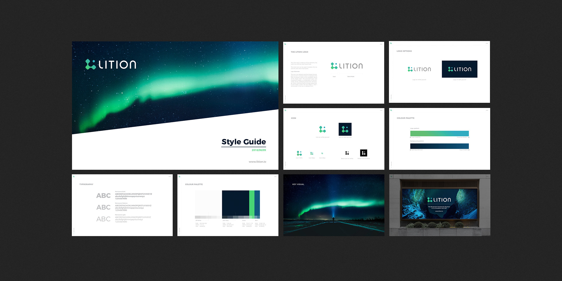
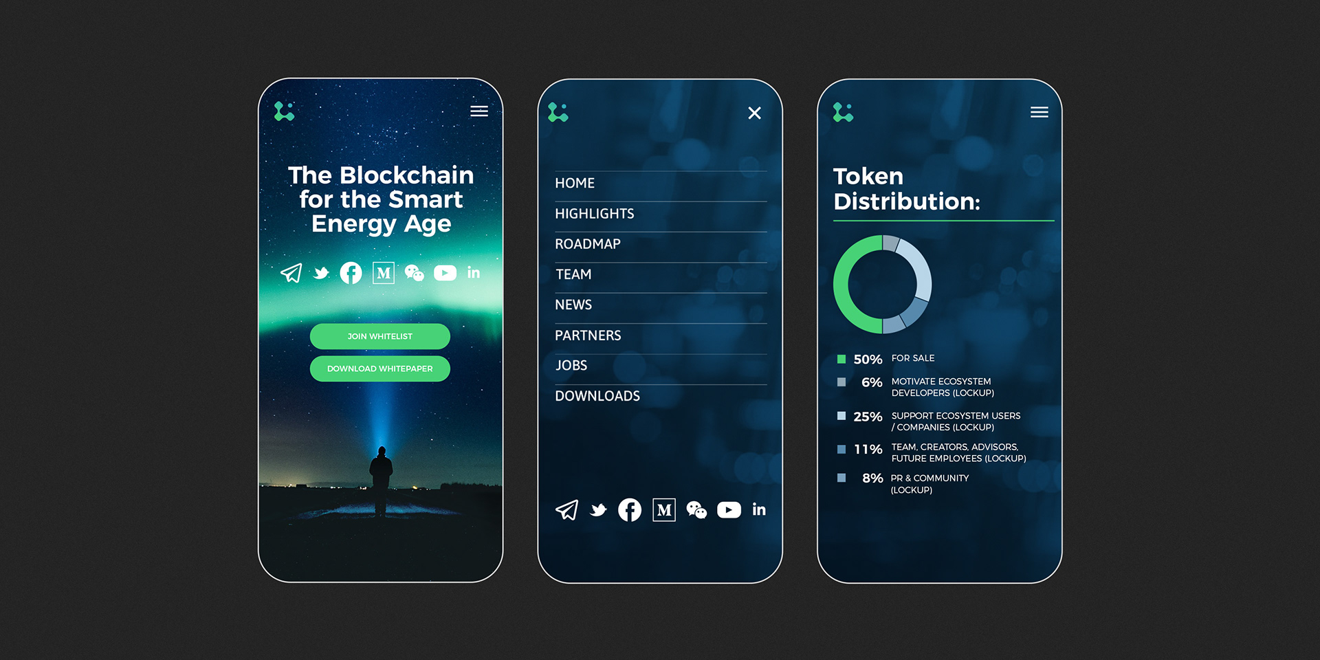
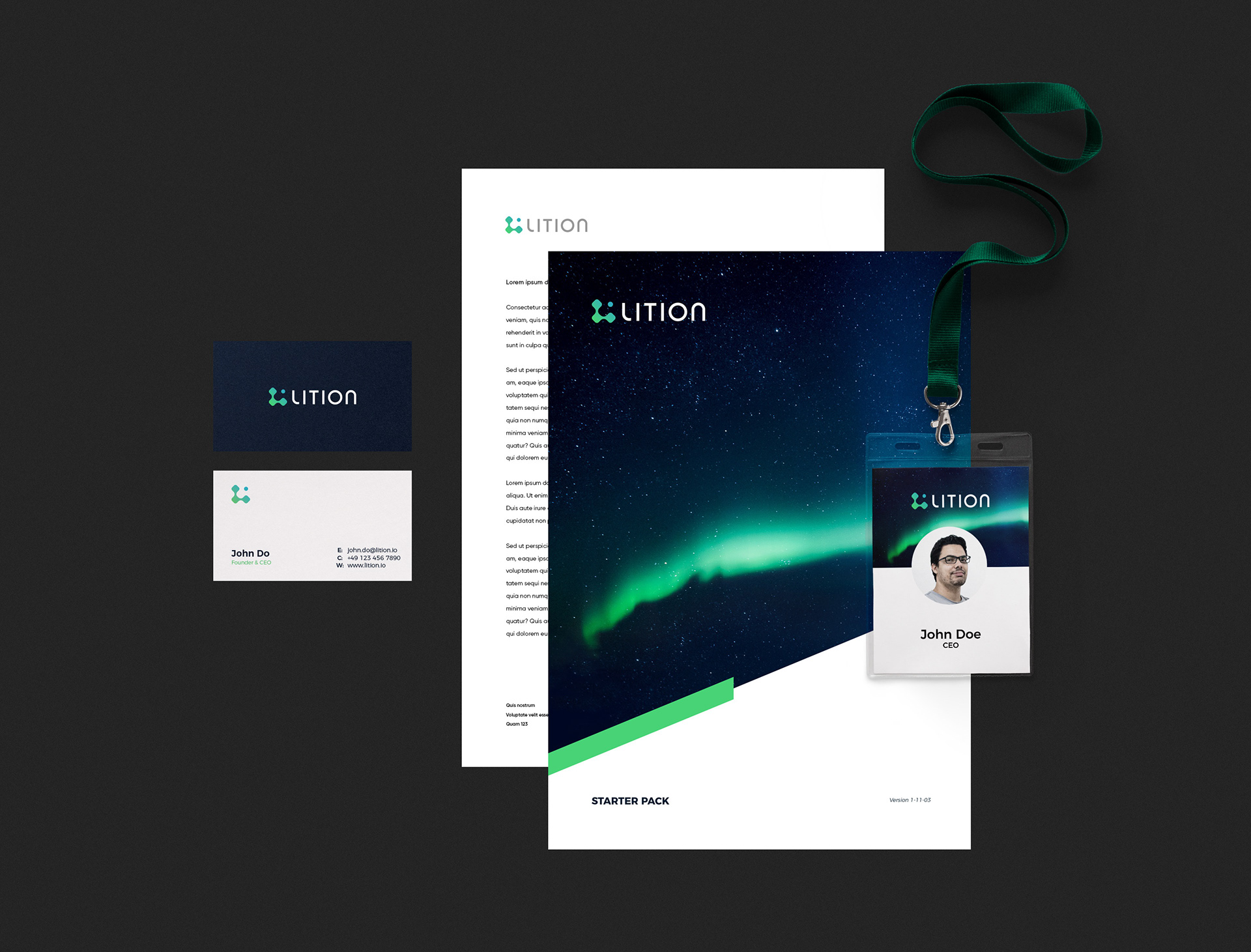
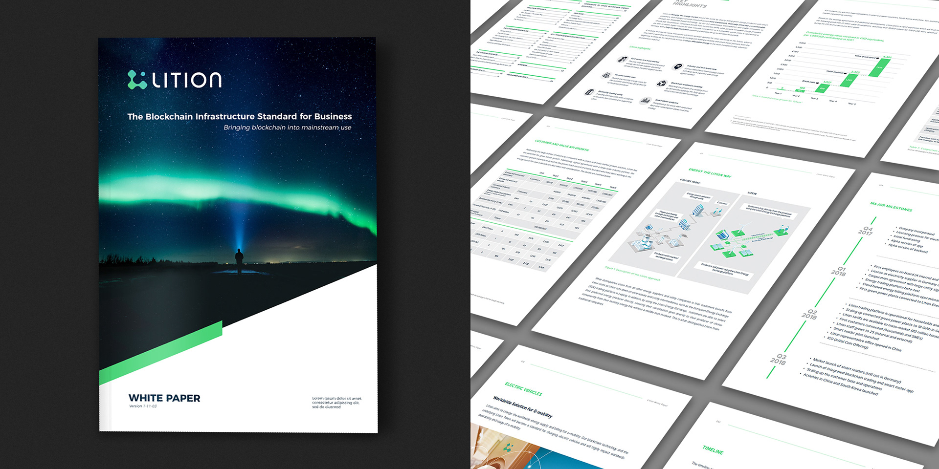
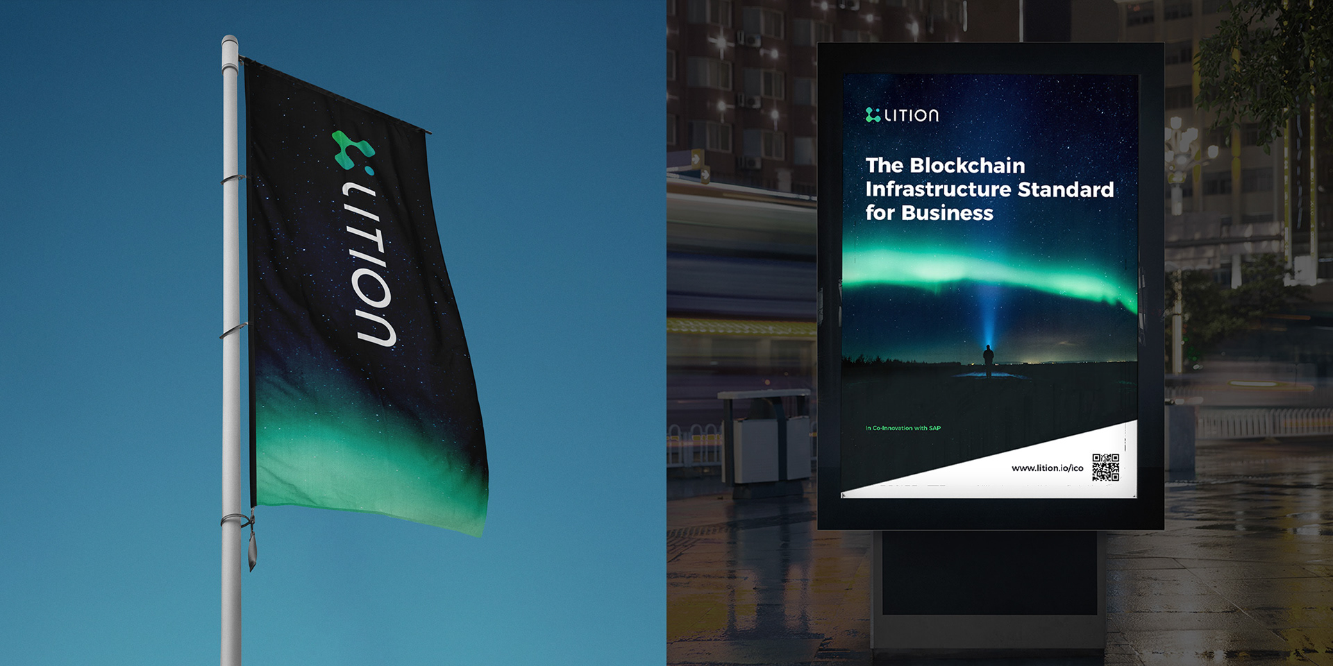
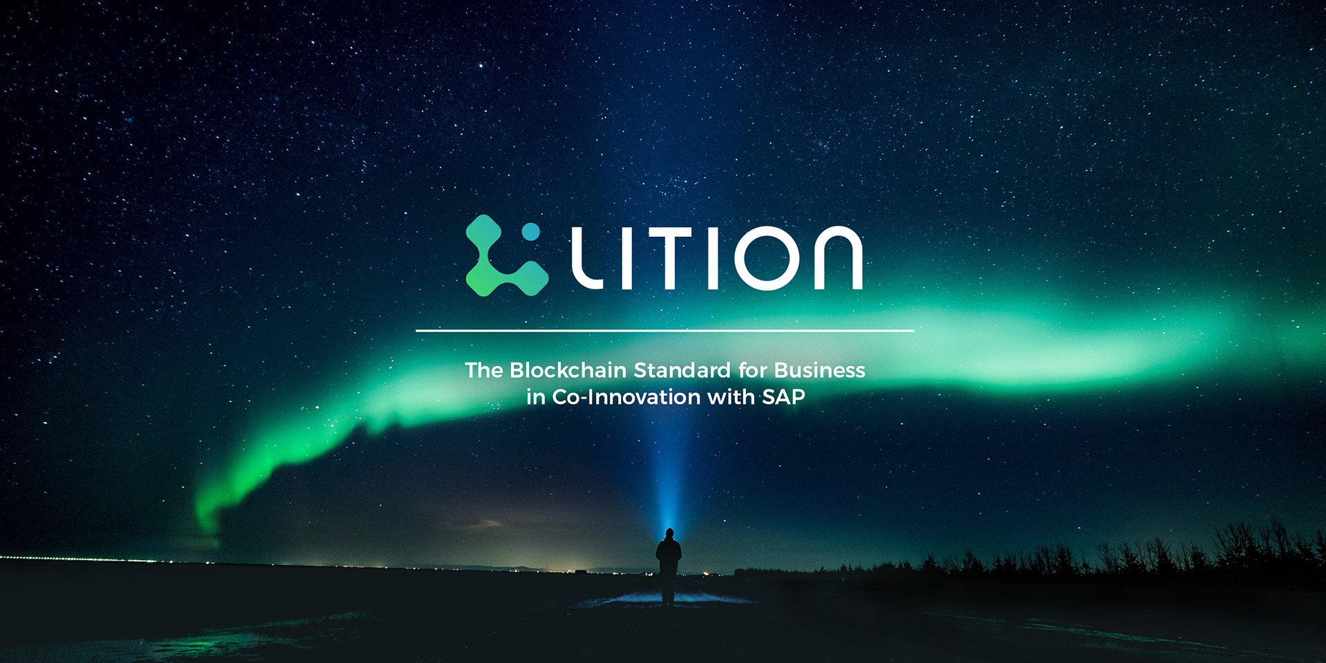
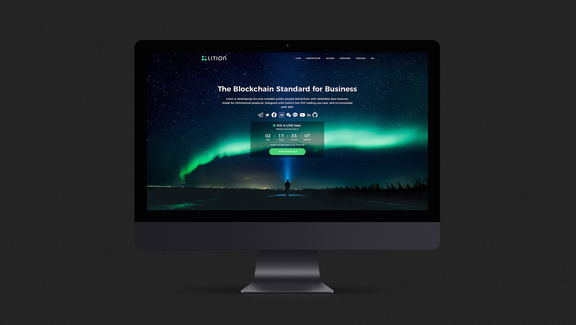
We found the somewhat mystifying image of an aurora borealis to be quite fitting within the context of blockchain technology, green-tech and energy.
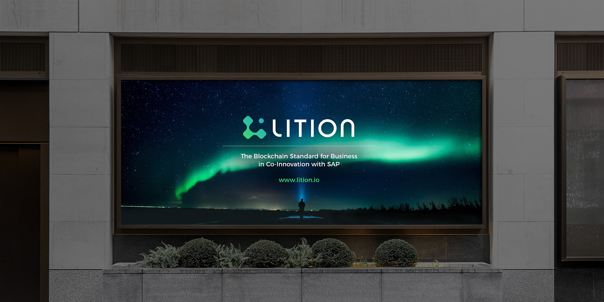
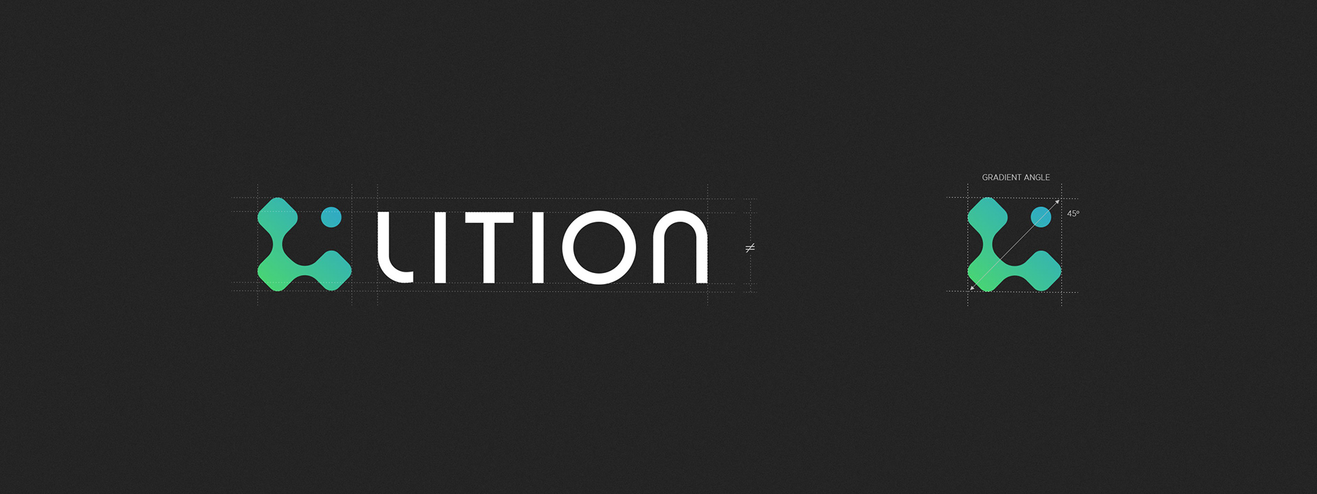
The Lition logo is made up of two elements: the Lition icon and the Lition word mark. The icon is an abstract and fluid shape that appears to be in constant motion. The perceived fusion and merging of shapes is a visualization of the processes of the underlying blockchain technology, where individual blocks emerge sequentially and create a chain. The two letters ‘L’ and ‘i’ can be seen in the icon in abstract form.
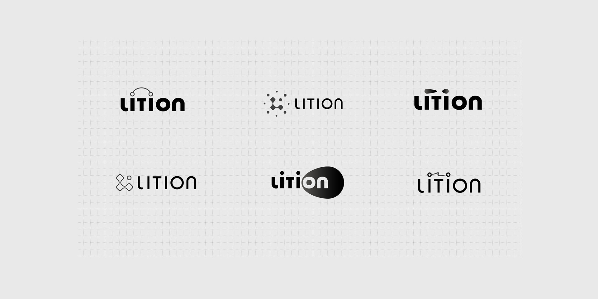
Various logo concepts were explored and presented during the early stage of the project. With the company clearly positioned to provide technical solutions for the energy industry, the notions of energy flow, electricity, illumination and e-mobility were tested as alternatives.
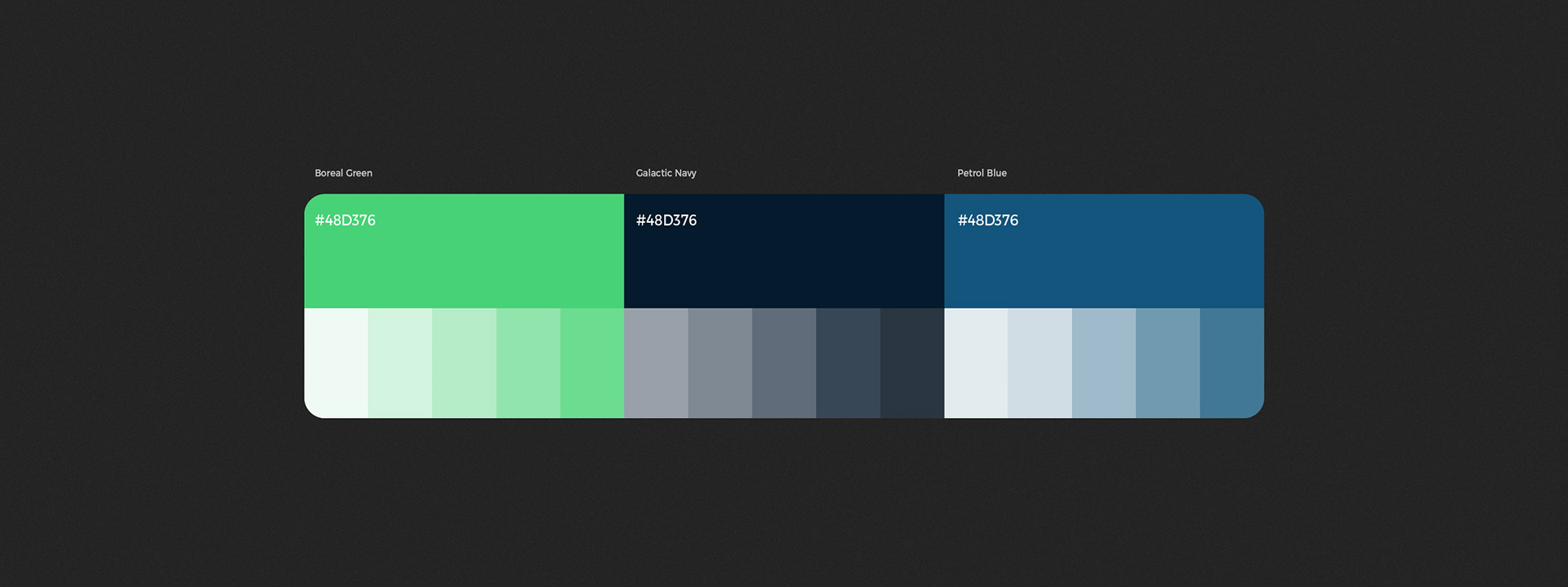
The Lition colour palette communicates innovation, greentech and authority. It was derived directly from the chosen key visual showing an aurora borealis in a night sky.