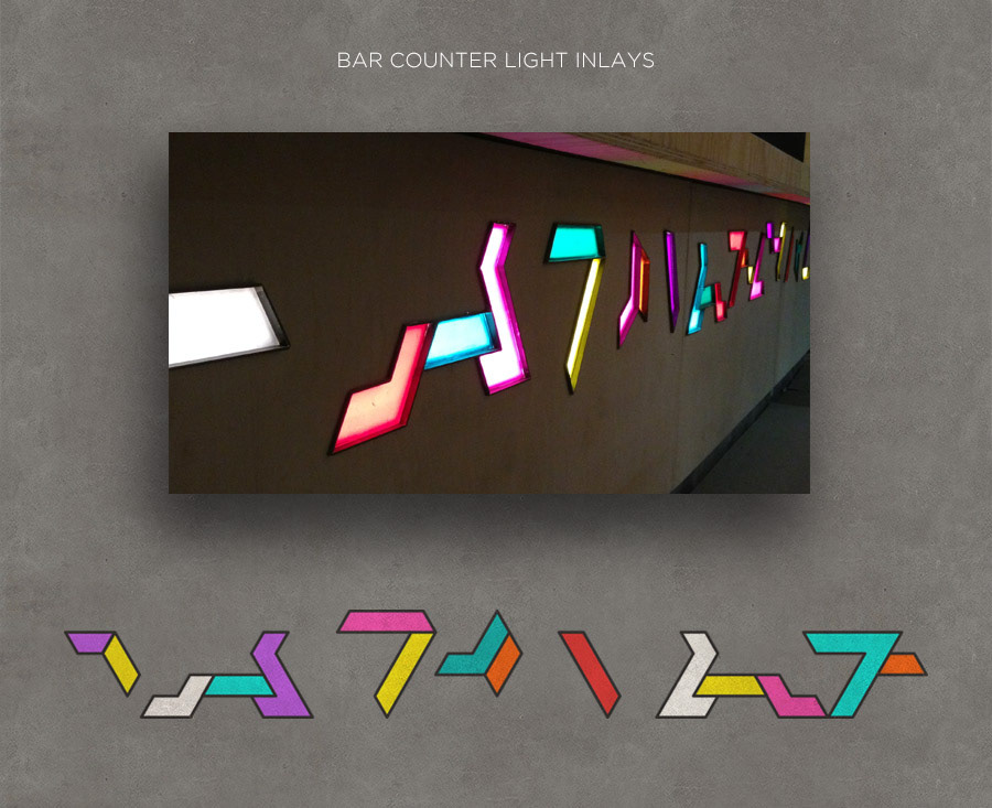
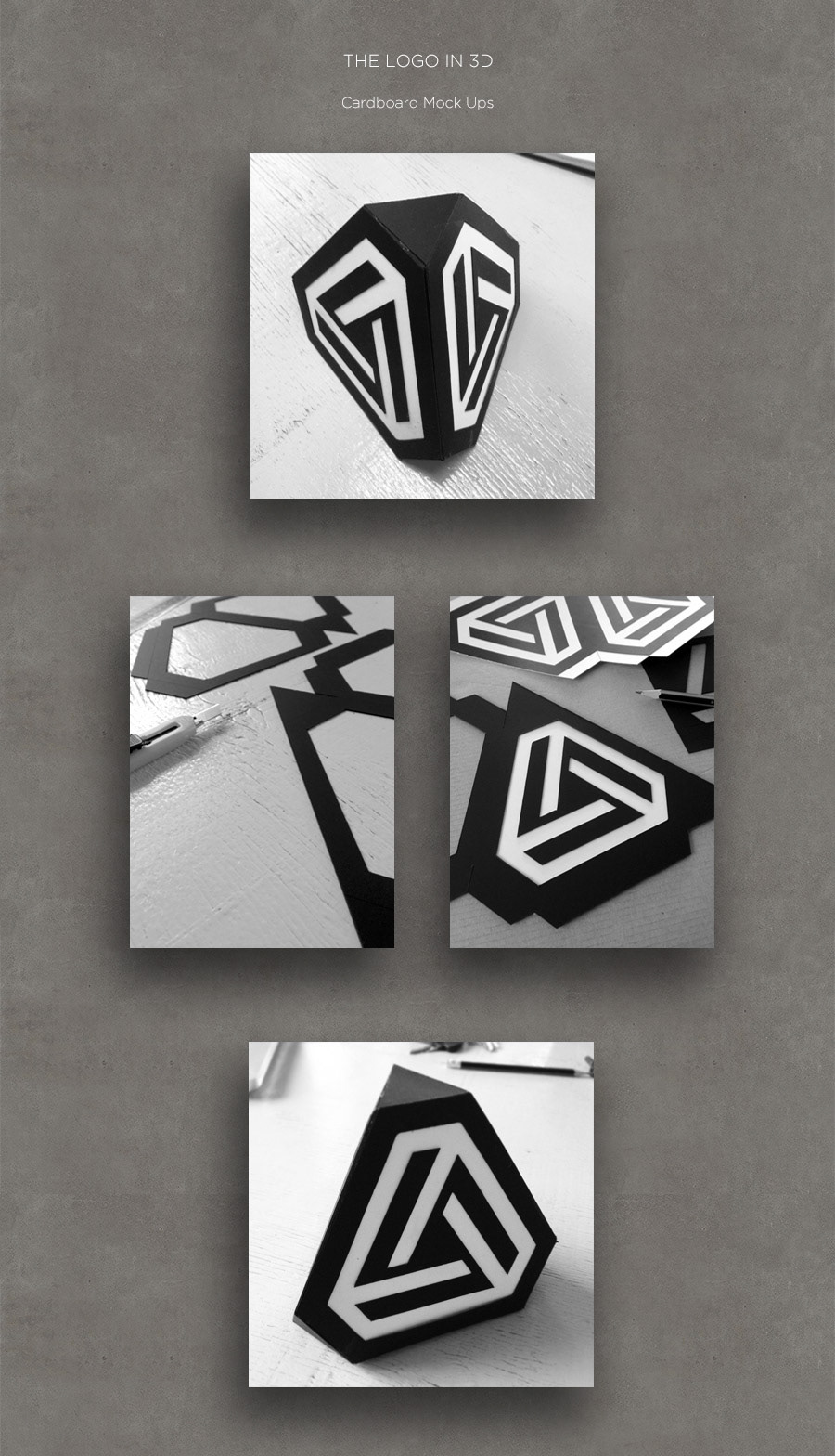
Being a part of the creative process since the inception phase of the ERA project gave me the opportunity to not only develop a comprehensive corporate identity, but to also apply the logo design and concept of impossible geometry in the 3D environment. Working closely with the interior designers and architects, I was involved in various aspects including surface graphics, iconography and product design.
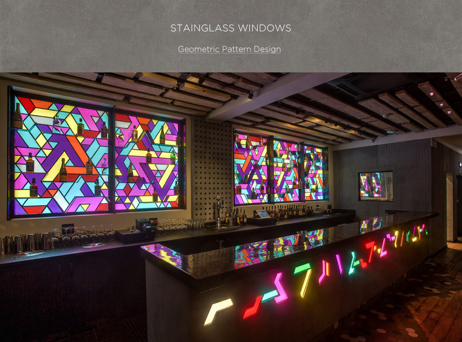
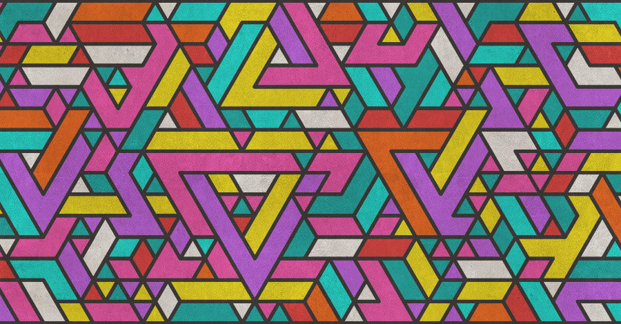
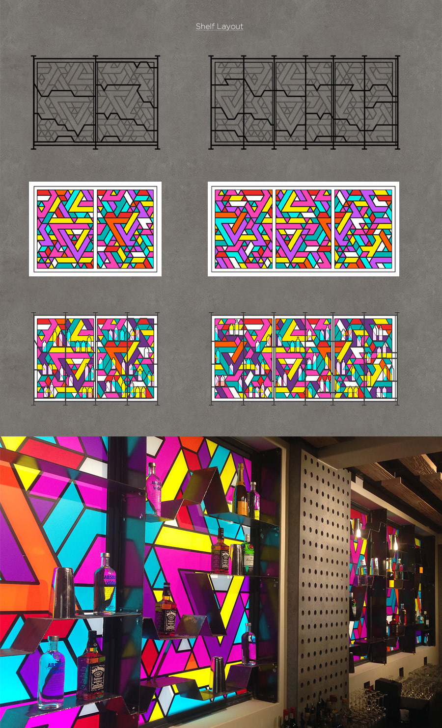
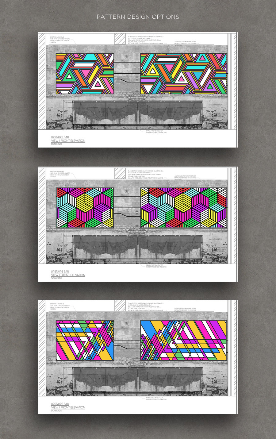
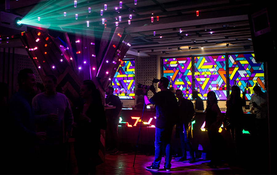
The club’s main bar was designed to have backlit windows illuminating the shelves and spirit bottles from behind. The client envisioned the windows to have a graphic pattern that was contemporary yet reminiscent of classic stainless windows.
I created an isometric pattern following the concept of impossible geometry, which was also applied in the logo design. The pattern’s individual pieces were laser-cut from coloured vinyl and then assembled to create the 5-panel window. The metal bar shelves were engineered to follow the outlines of the geometric pattern.
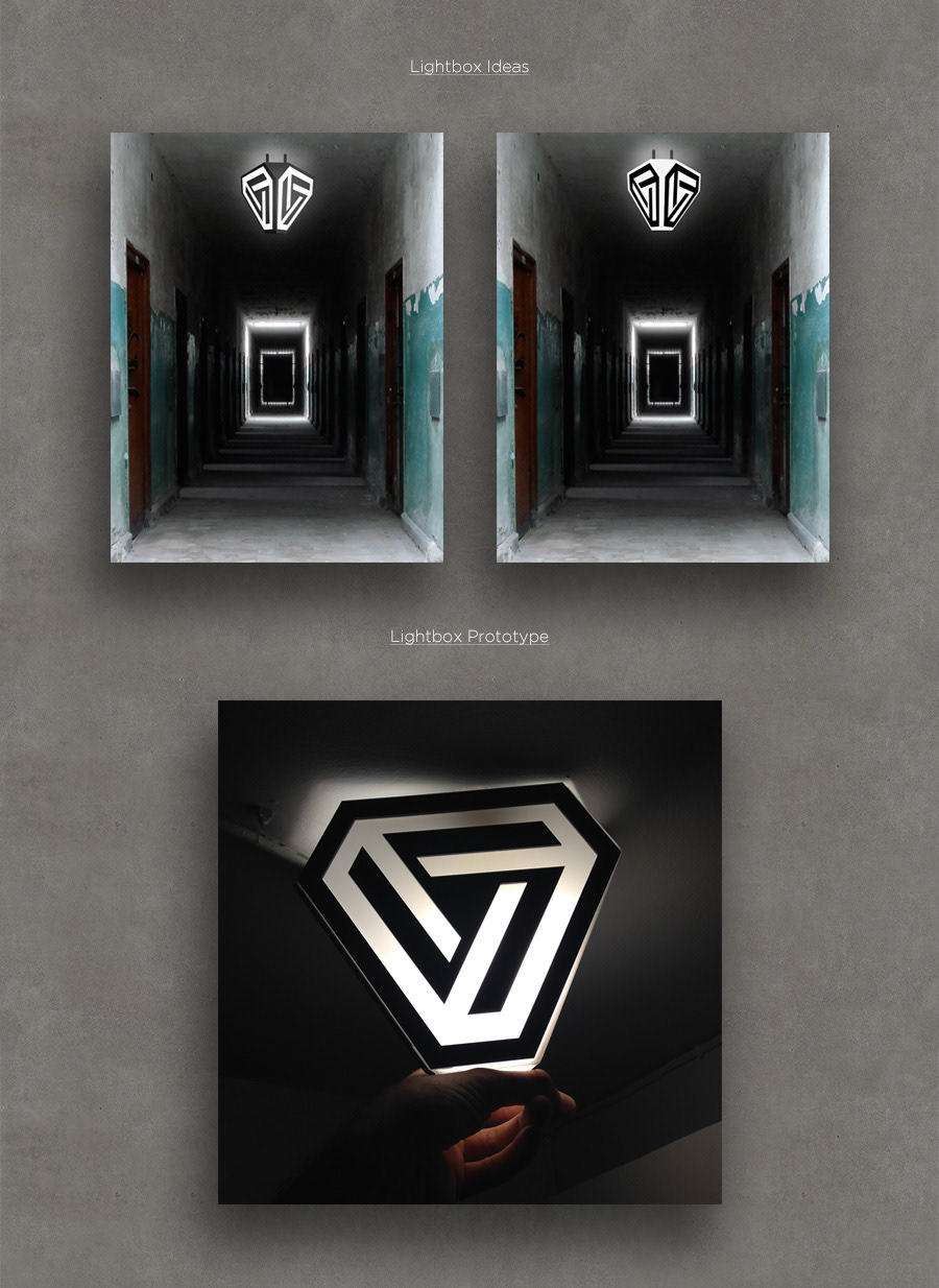
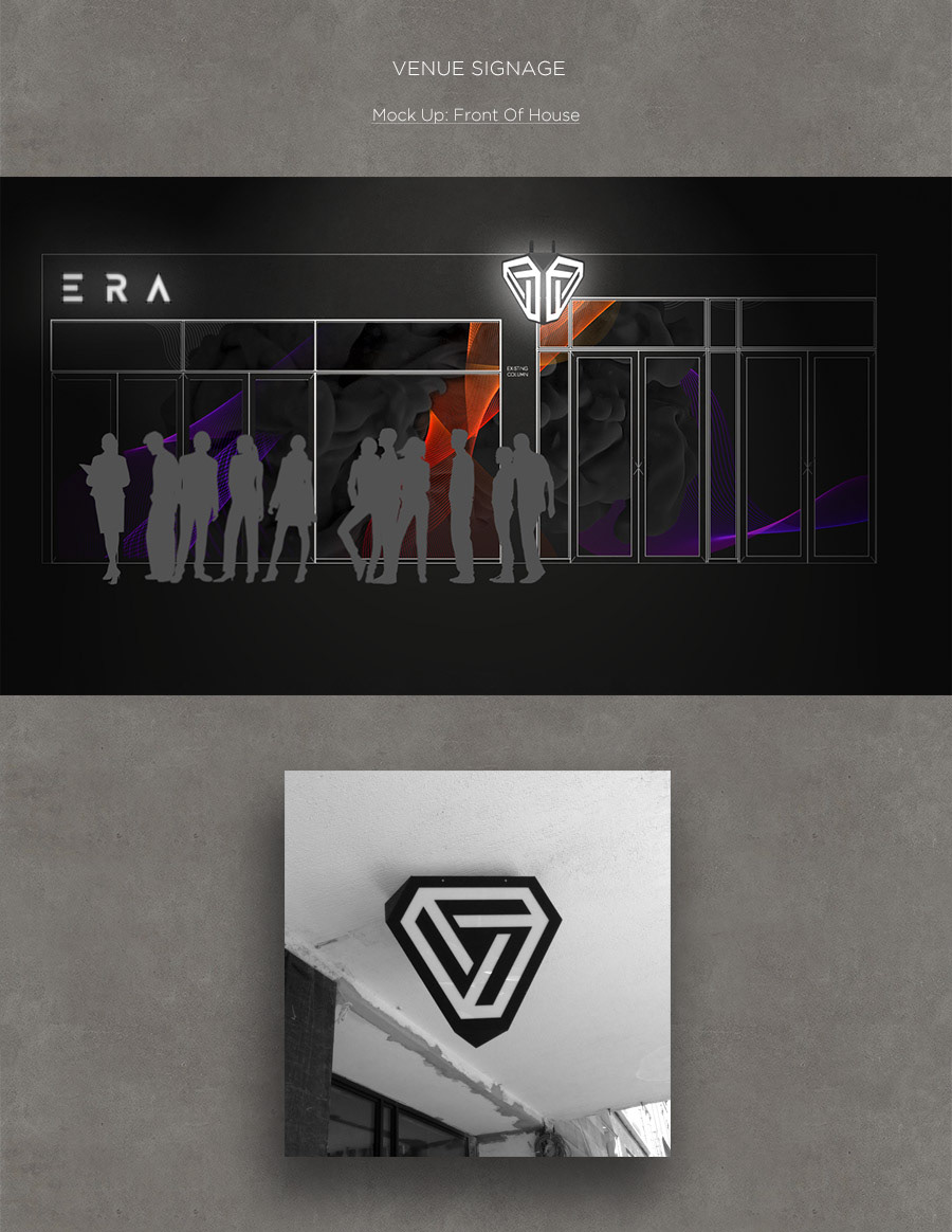
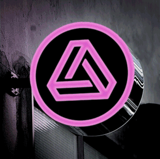
The client eventually settled on the idea of a round lightbox with a pulsating, colour-changing LED light to be the main signage outside the venue.
The idea of the 'upside-down pyramid' design was abandoned as it was deemed to have negative connotations.