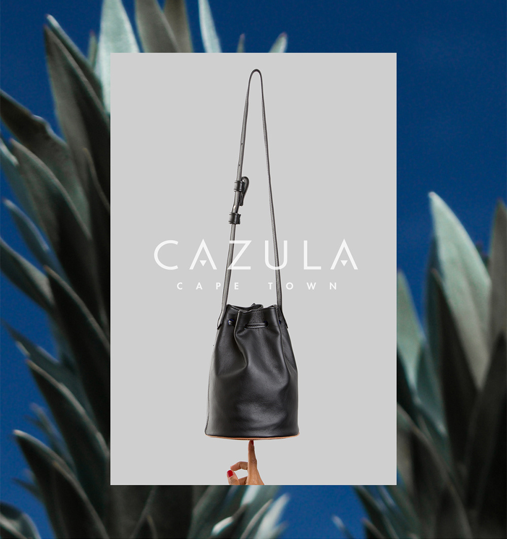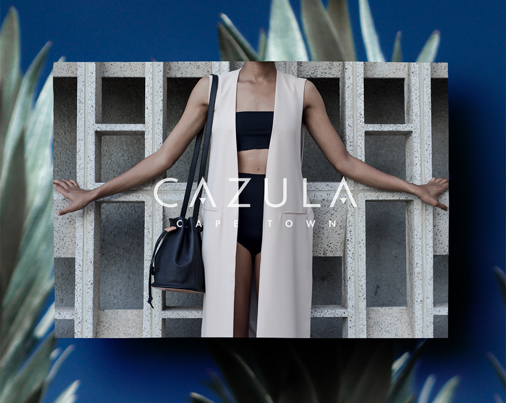

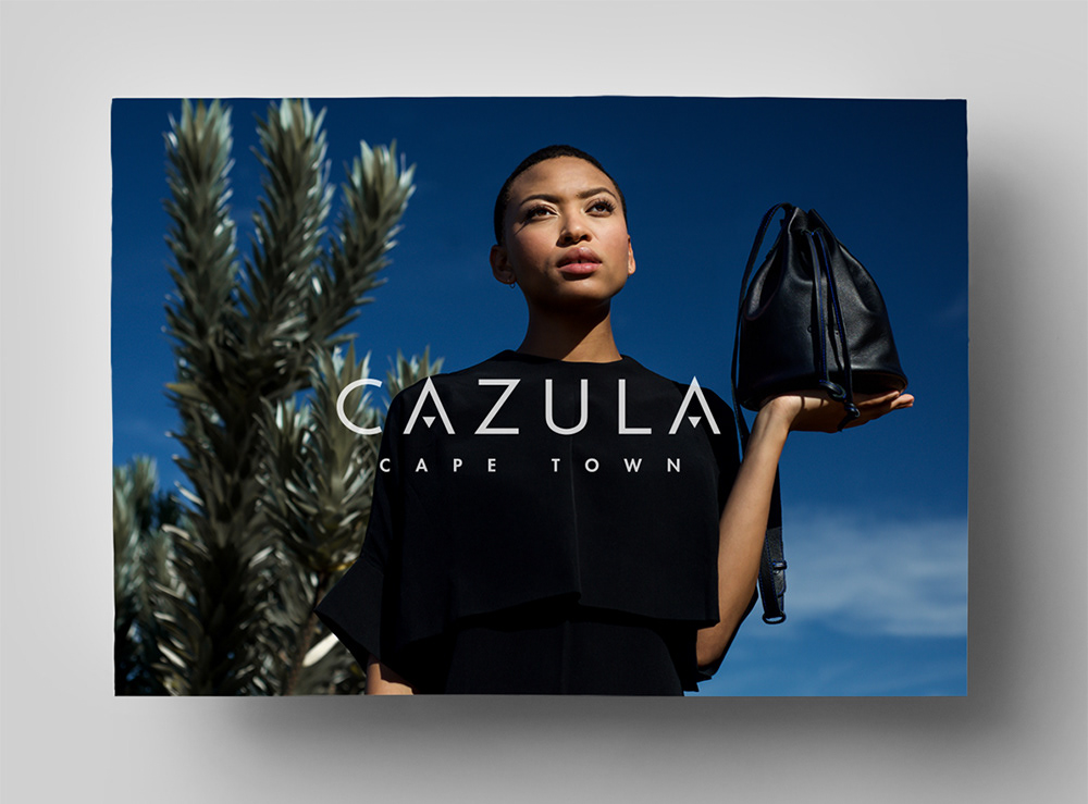
Corporate Identity design for Cazula, a Cape Town and Berlin based start-up label producing leather bags and accessories. The challenge was to achieve a merged design aesthetic conveying both a distinctively African as well as a minimal European look & feel.
The logo typography is based on a timeless, industry-appropriate sans serif typeface, which was customized with triangular shapes, adding a graphic African element to the composition. The letter spacing was widened to achieve a sense of balance and proportion.
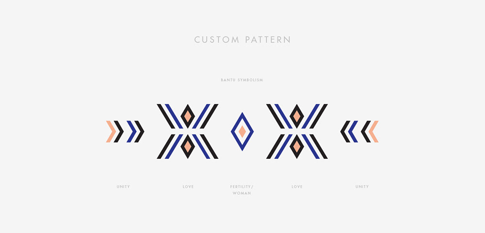
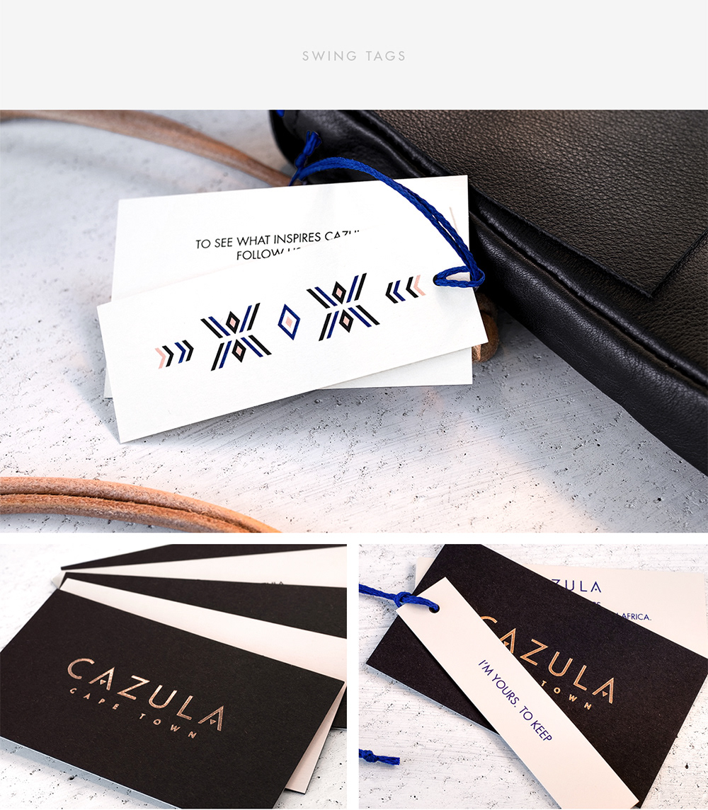
To add another graphic element to the C.I., African bantu symbolism was reimagined in a clean illustrative style, creating a custom pattern that is further exploring design principles of symmetry and unity. The same graphic pattern is being interpreted in strips of traditional handmade beadwork, which are then attached to Cazula’s products as an extra design element.
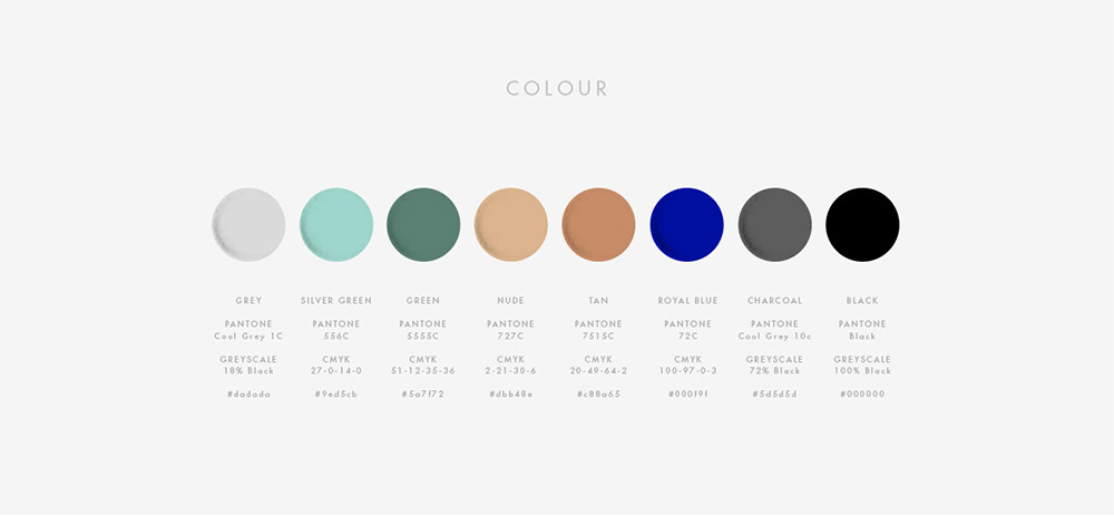
The chosen brand colours mirror a distinctively Cape Town palette: sky and ocean blue, warm earth tones and silver-greens, which reflect the local flora, specifically the indigenous and uniquely graphic silver tree, which also features strongly in the debut campaign imagery.