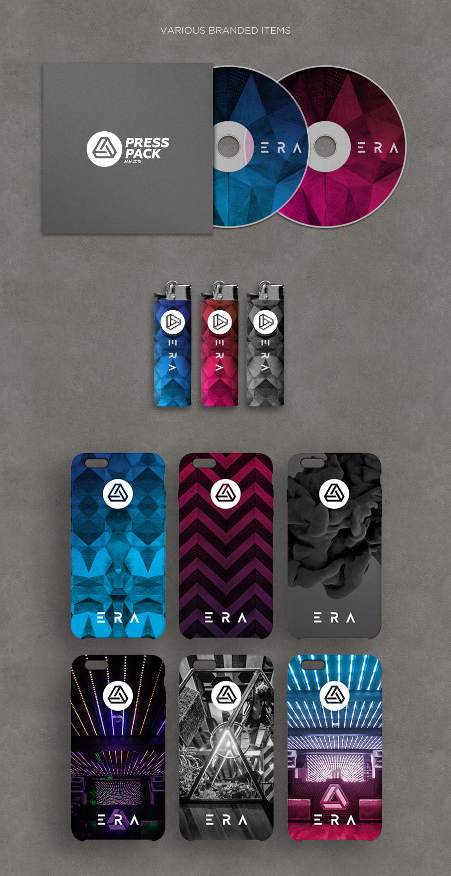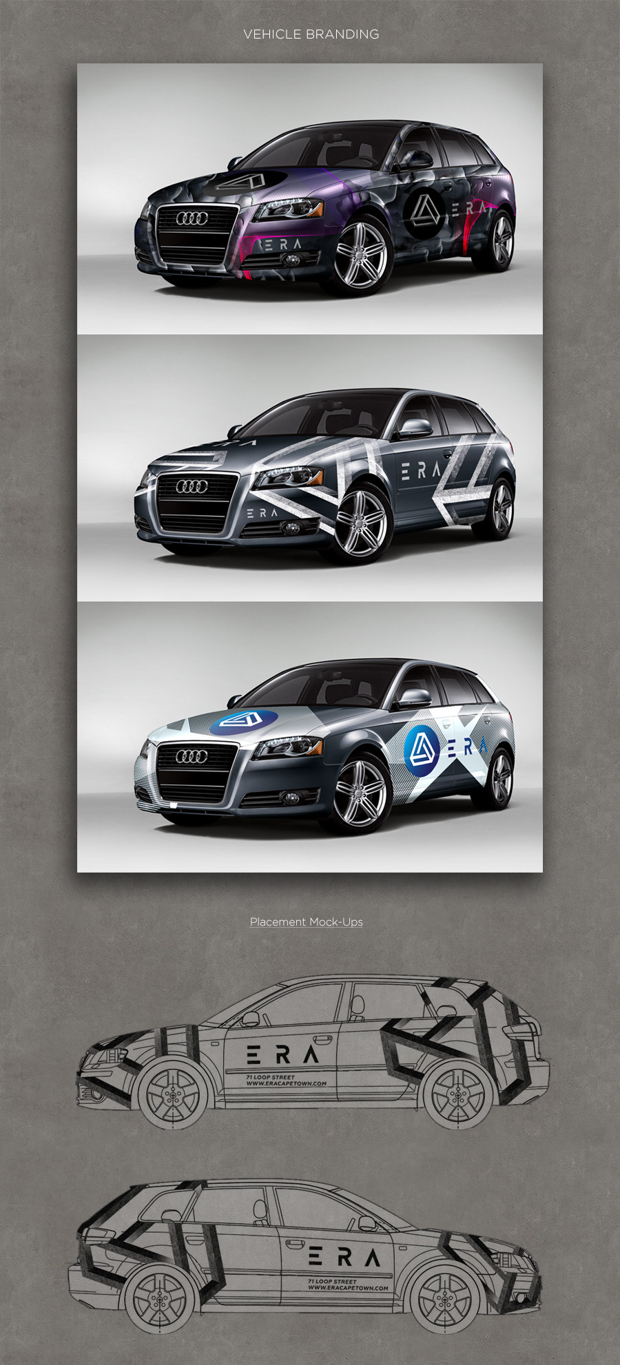
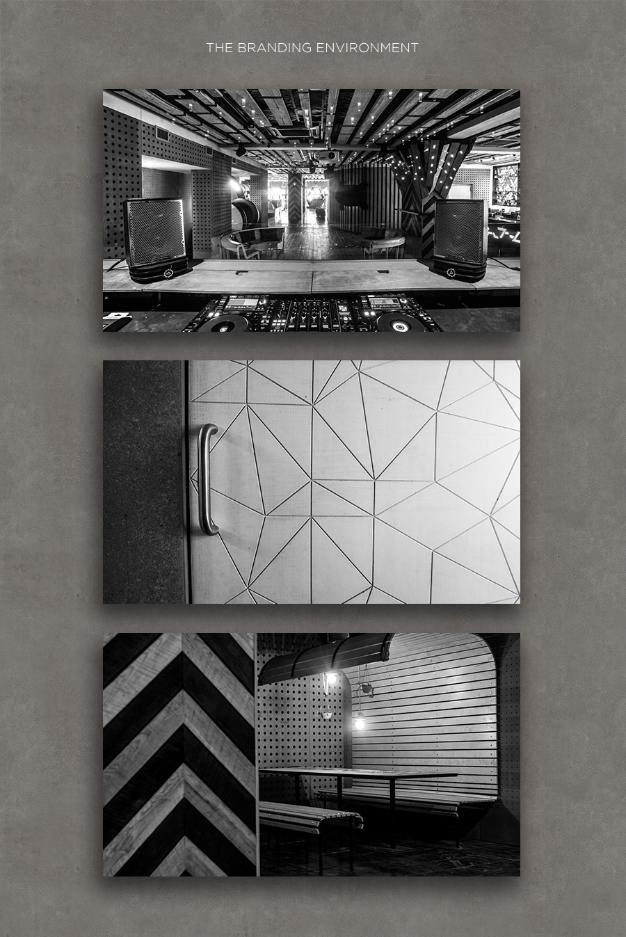
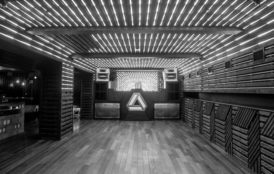
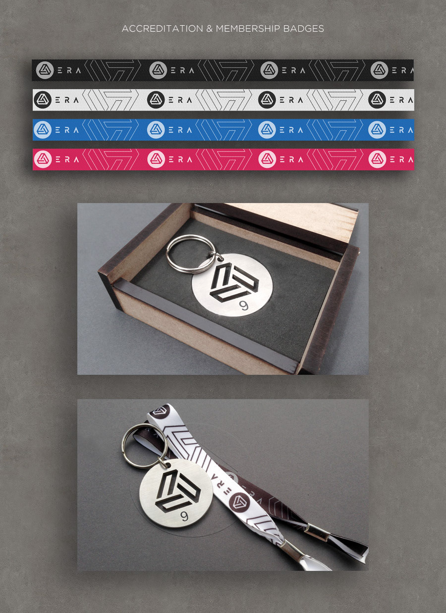
Comprehensive Corporate Identity design for electronic music club ERA. Launched in September 2014, ERA has quickly become Cape Town’s prime clubbing venue and stable favorite of lovers of techno, house and affiliated genres. Equipped with one of the world's best club sound systems and cutting edge interior design, the brand needed a bold and compelling visual identity that would live up to the claim that new industry standards in design and technology would be set.
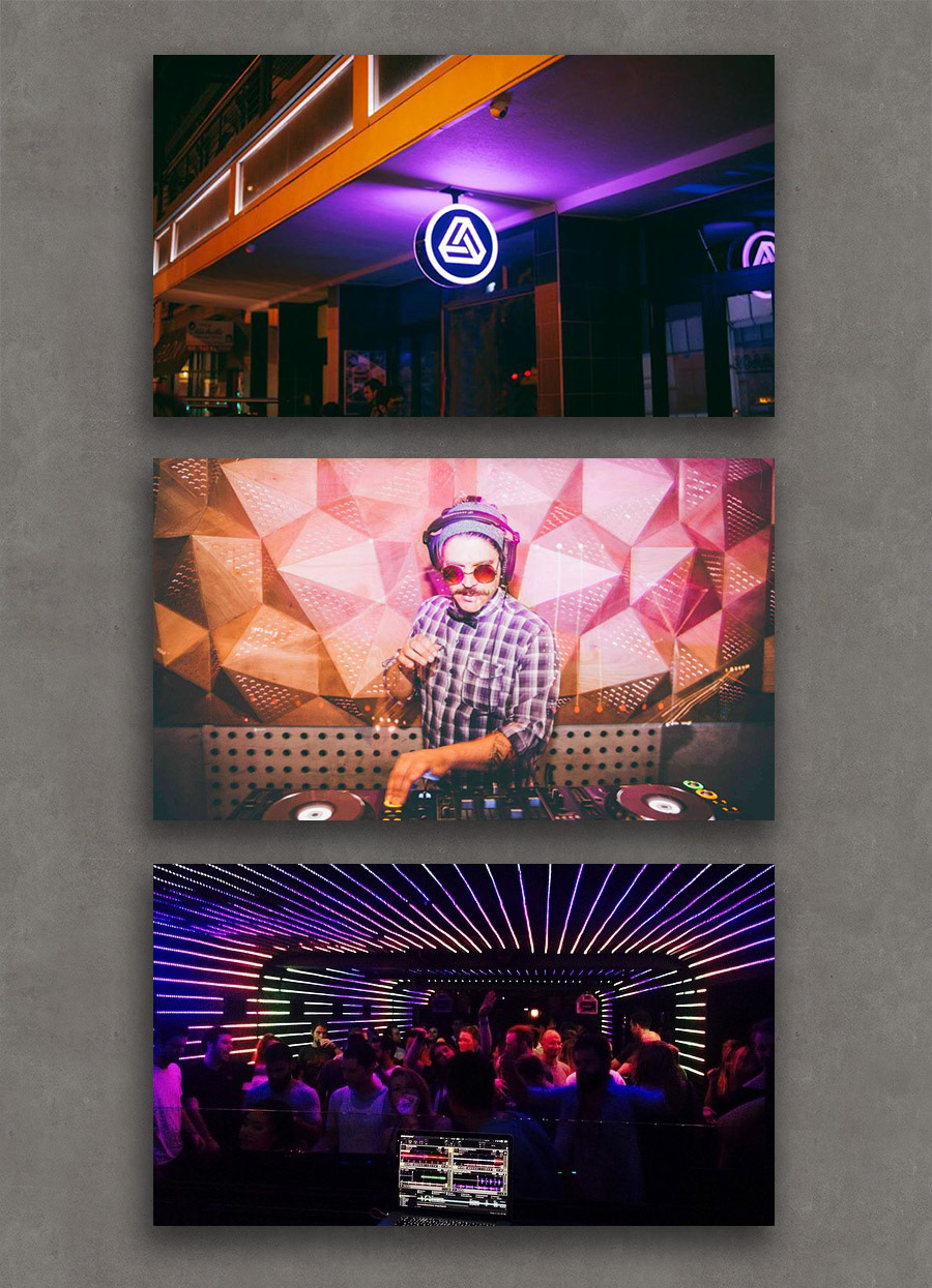

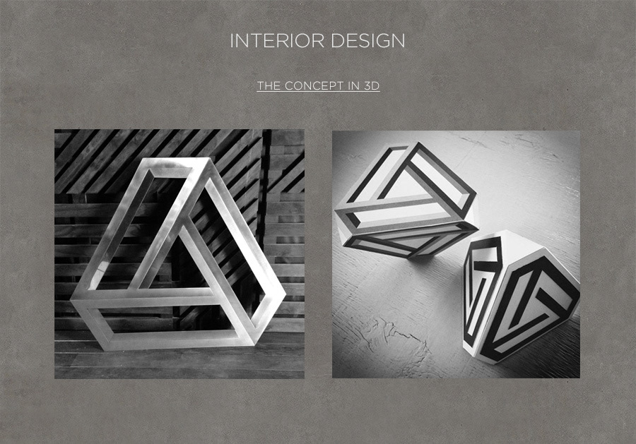
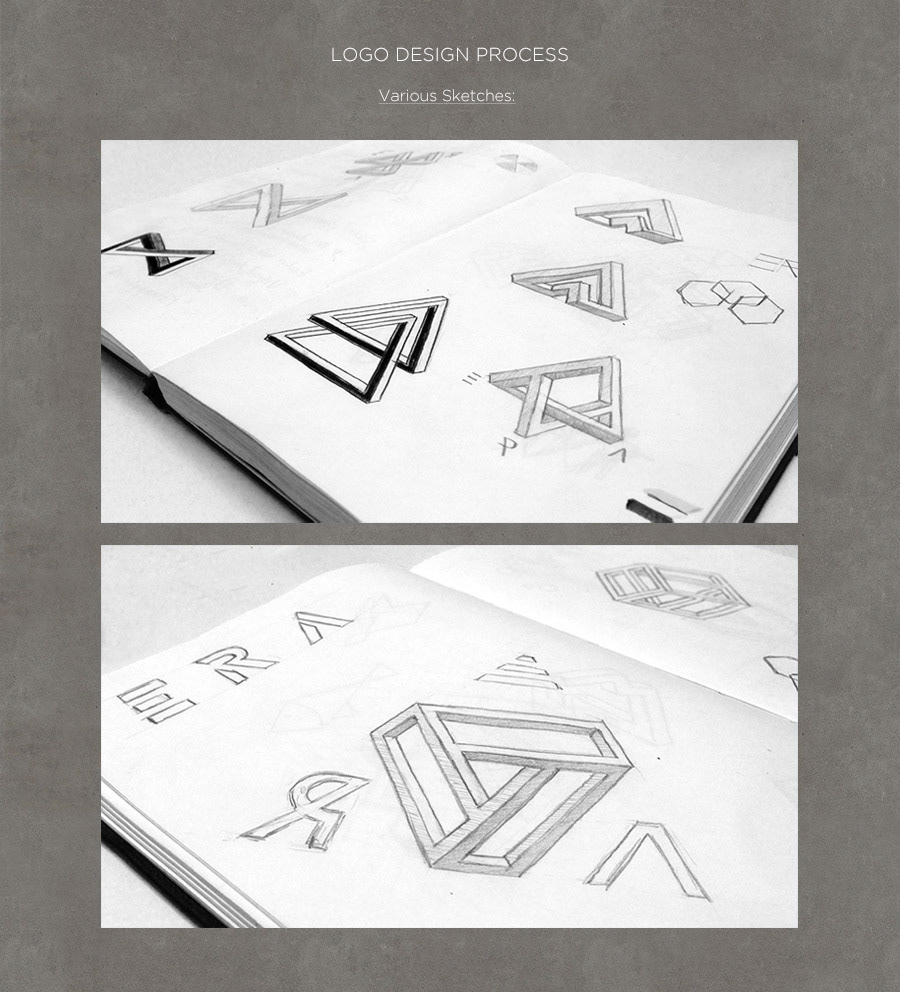
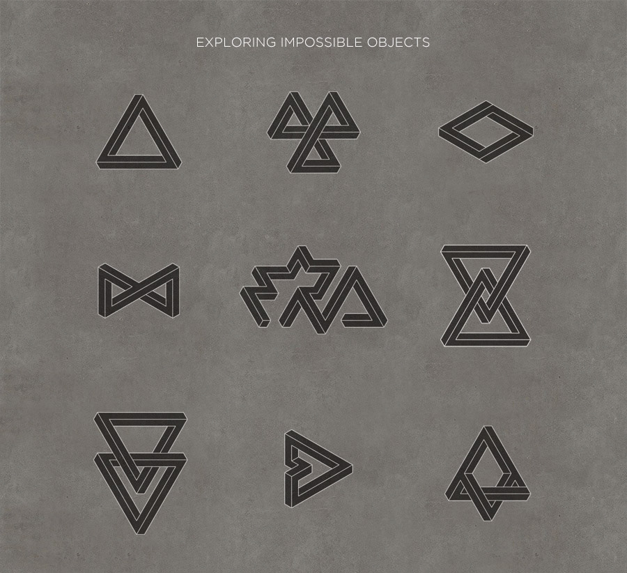
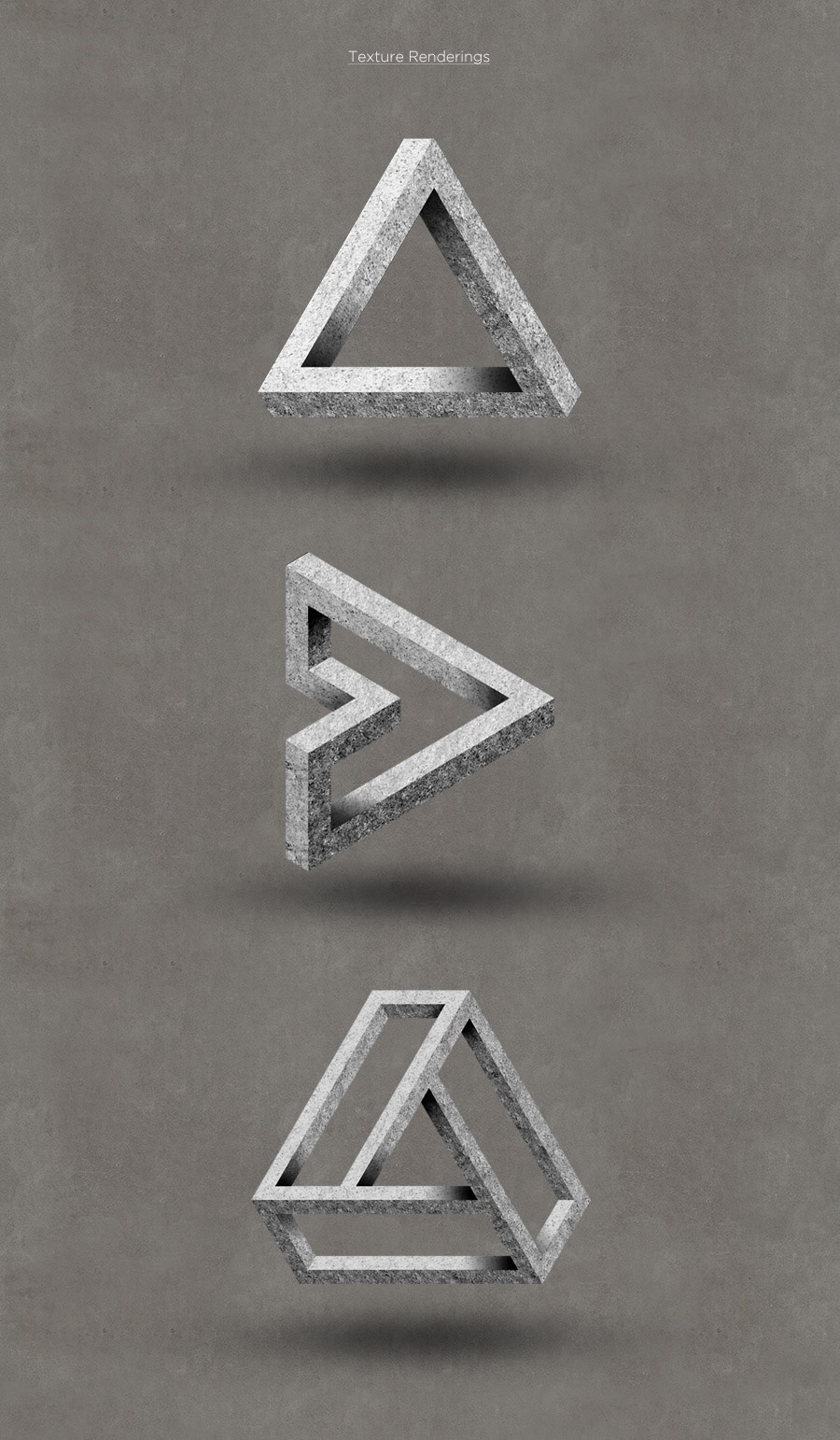
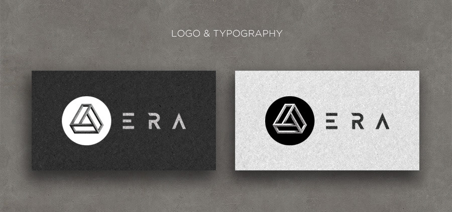
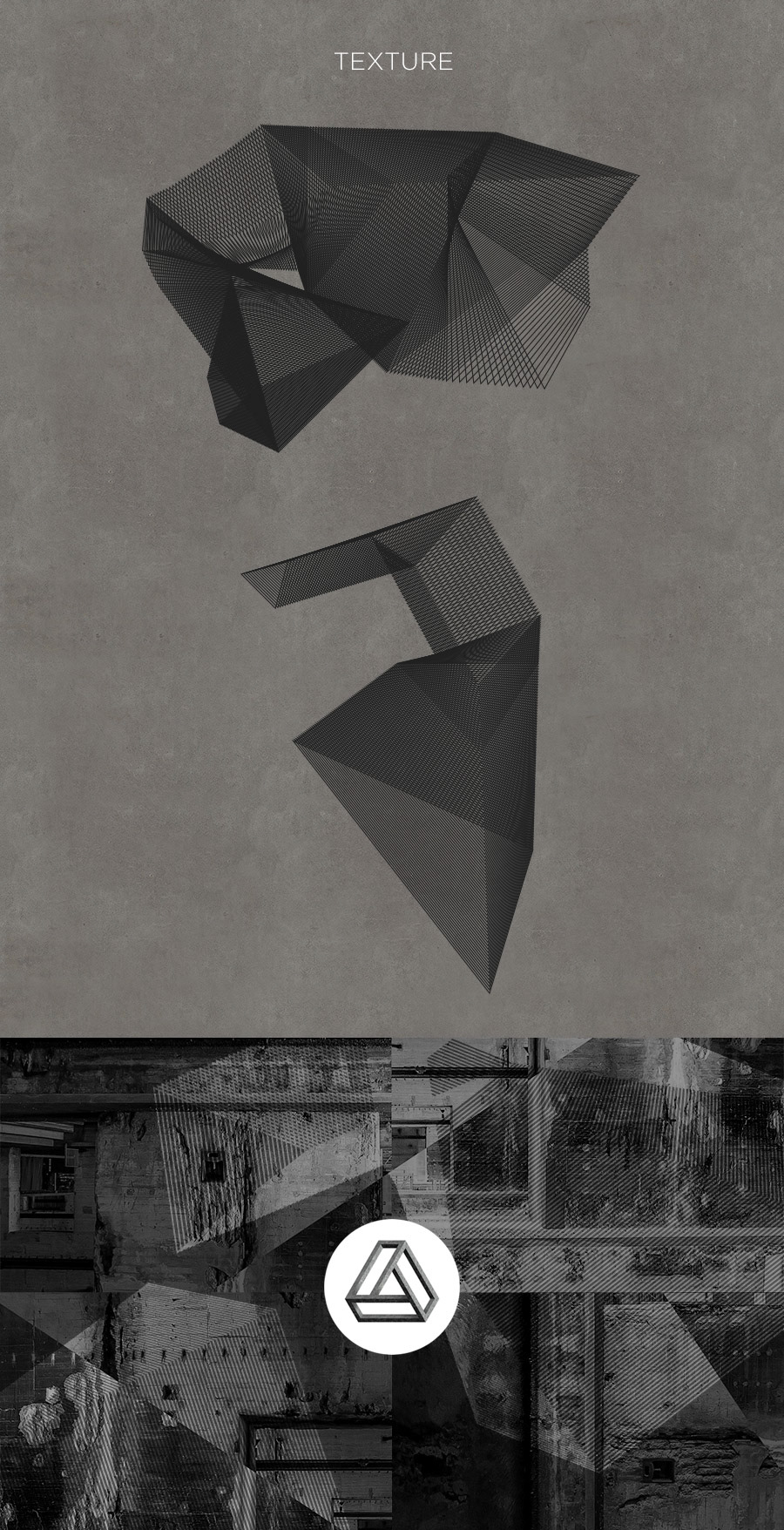
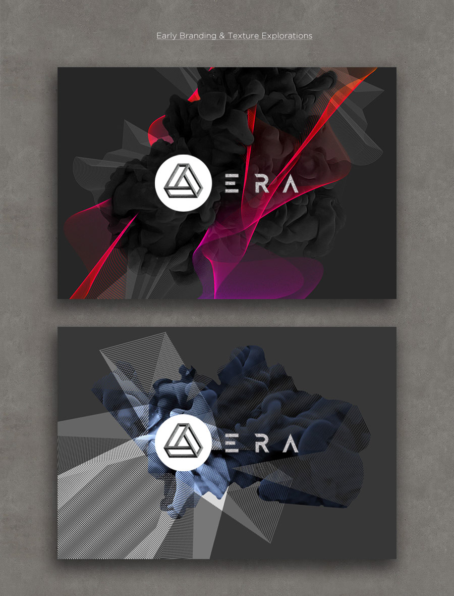
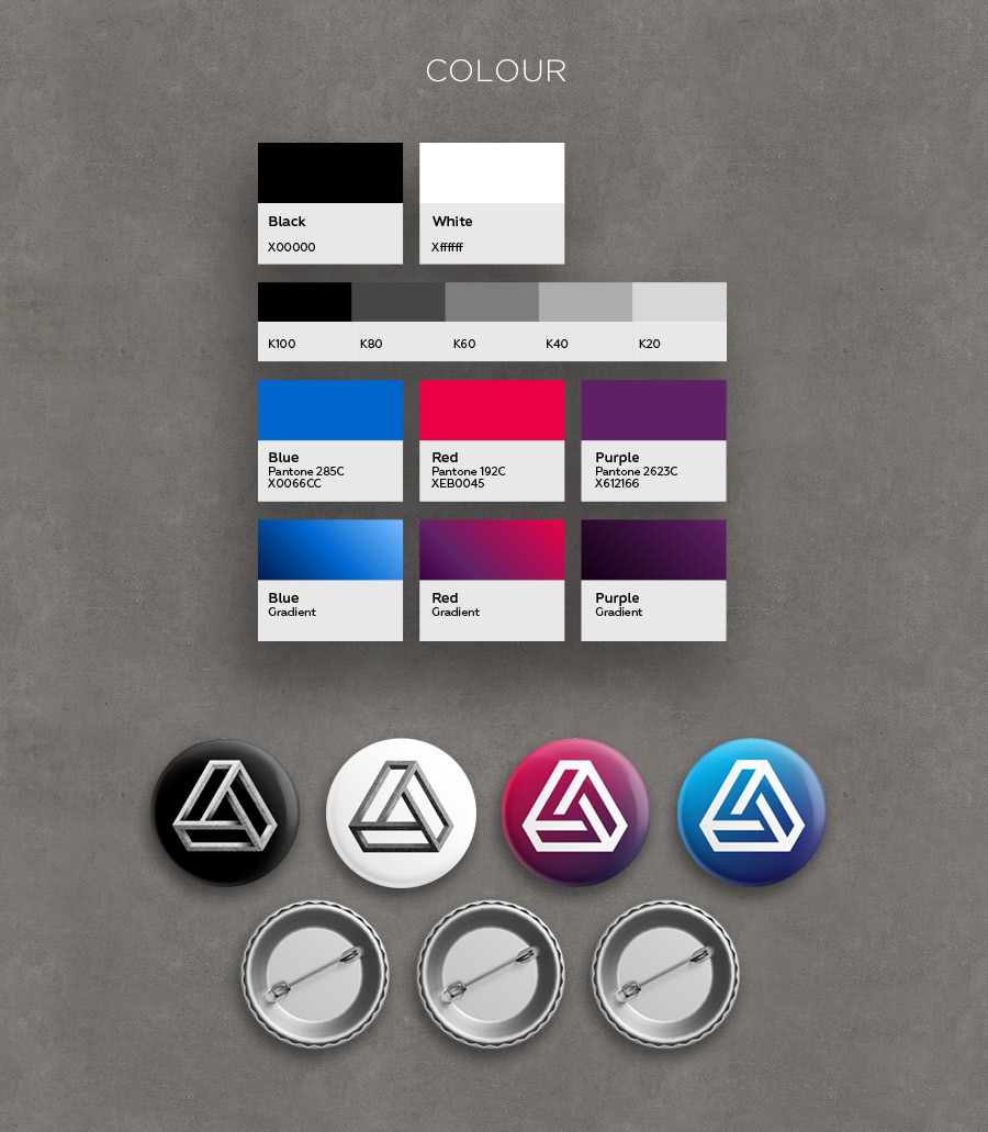
The client envisioned a dark, industrial and heavily textured look & feel in support of the underground techno theme and bunker-style setting. The logo design is inspired by M.C. Escher and Oscar Reutersvärd’s studies of optical illusions and impossible geometry.
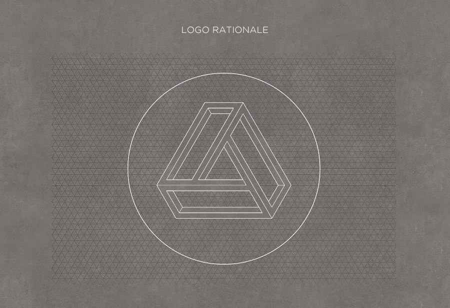
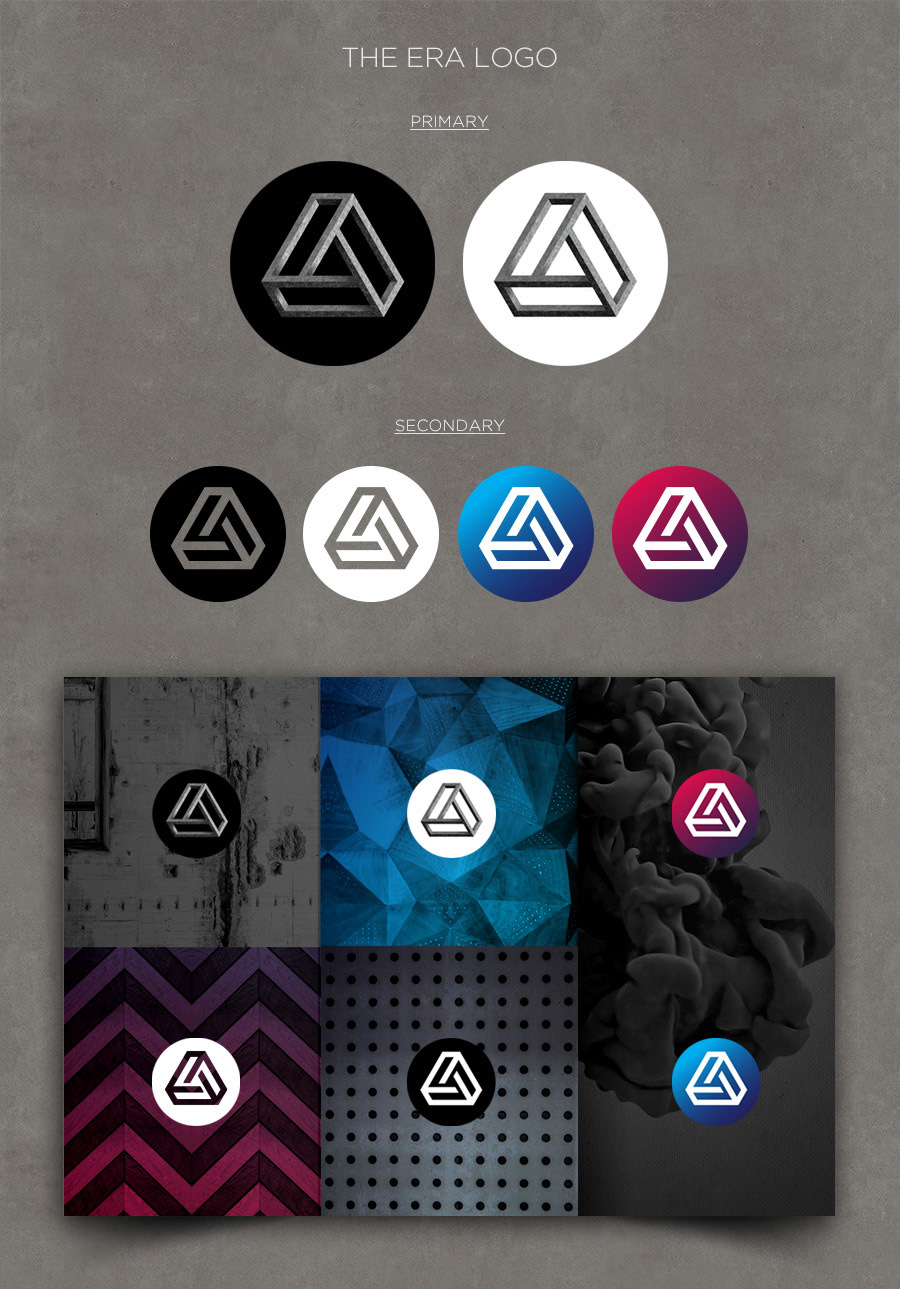
The ERA symbol is an ‘impossible object’ in the classic sense, derived from the original Penrose triangle, which lies in its centre. It is a perfect geometric shape with 3 equal sides based on the isometric grid. The symmetry means that the shape is infinite. It repeats itself every 120º, if rotated.
The symbol represents continuity as well as recurrence, the cycle of life and the way artistic or musical periods feed off and inform each other. The optical illusion within the shape reflects the disorienting and dreamy experience sometimes associated with electronic music.
The trinity within the shape correlates with the 3 letters in the word ‘ERA’.
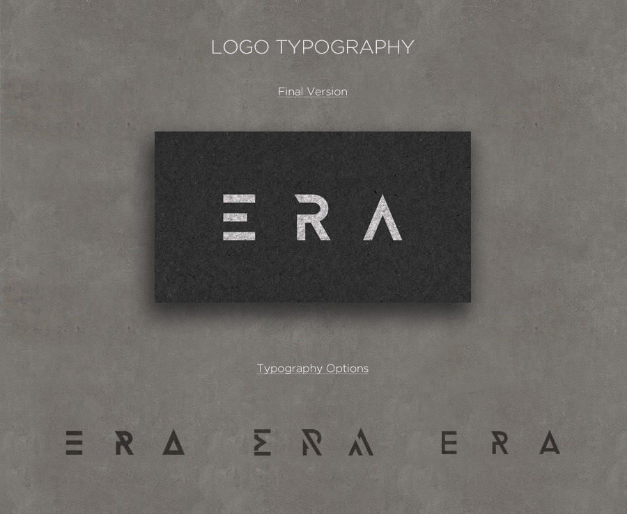
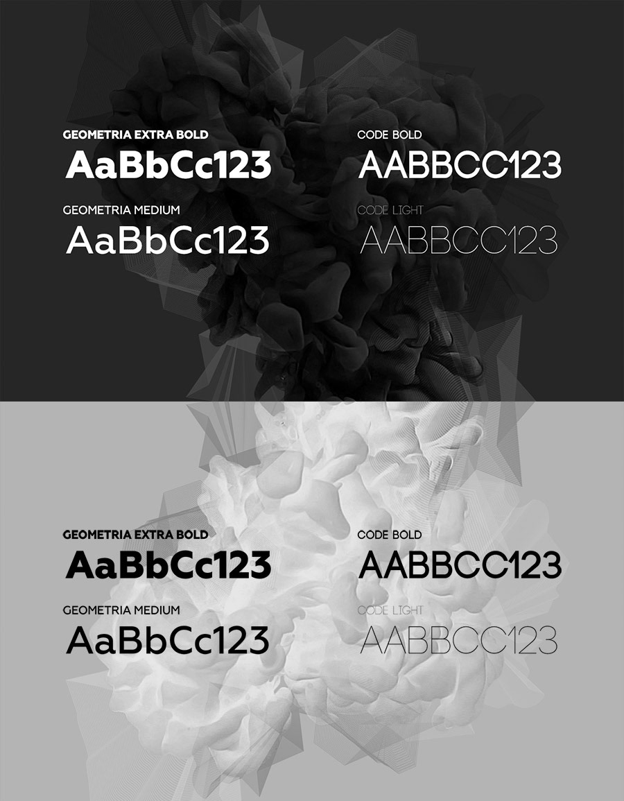
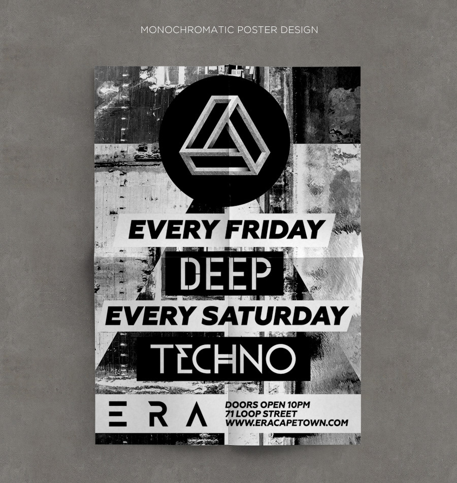
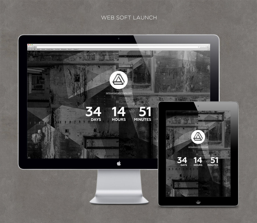
The principal typeface applied throughout the ERA C.I. is Geometria. It can be used in various weights. For flyer designs, the Code font family is often utilized.

The underlying theme informing the flyer designs is loosely based on the concept of ‘hyper reality’.

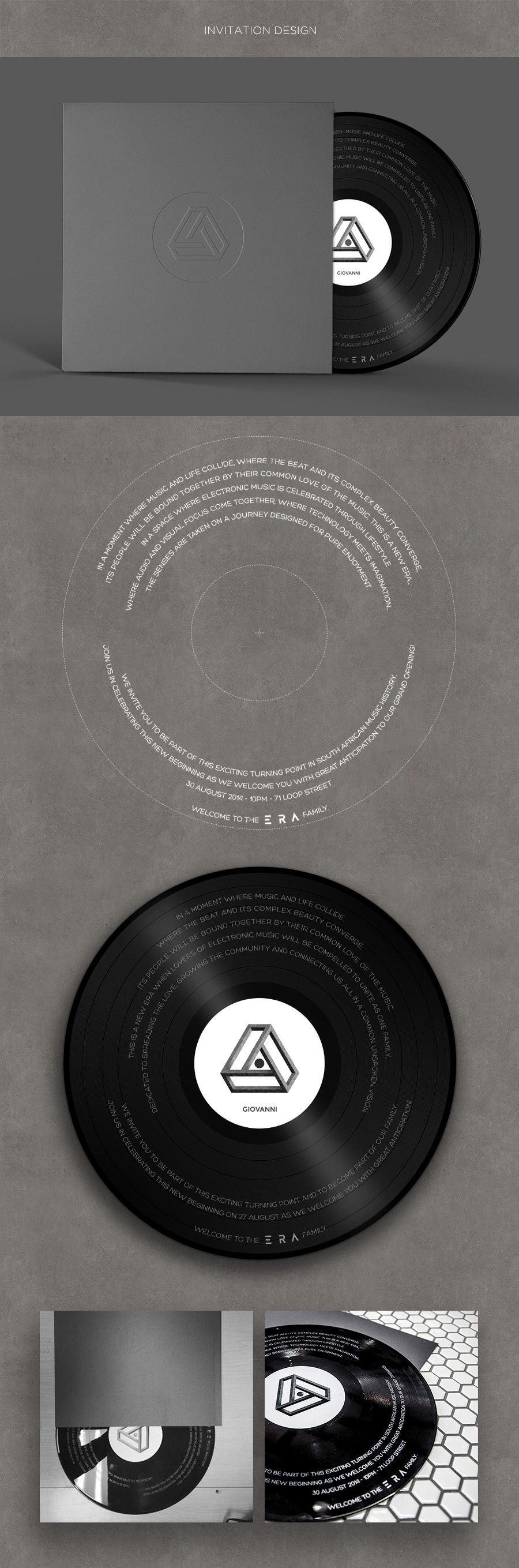
The invitations to the ERA Industry Launch were printed on vinyl records, which were sleeved in embossed cardboard envelopes. The invites were then hand-delivered to selected industry players prior to the launch on 27 Aug 2014.